Olivetti, Pintori, Nivola: the Poetic of Dreams and Metaphors
by Veronica PeanaJanuary 2021
Founded in 1908 by Camillo Olivetti, the company - a bastion of technological progress and Italian creativity - holds notable records, from the 1954 "Compasso d'oro" award for design, to its continued youth and rediscovery by new generations.
The brand's consecration did not come only a result of the quality and avant-garde nature of its products - just think about Studio 54 and Valentine designed by Sottsass, or Lettera 22, considered a masterpiece of modern art; you have to pay attention to the background, the creative team, the ingenious communication that led to the purchase of the actual product.
The company, it is worth remembering, dominated the graphic and advertising scene of those days, and reinvented the conception of its commercial spaces.
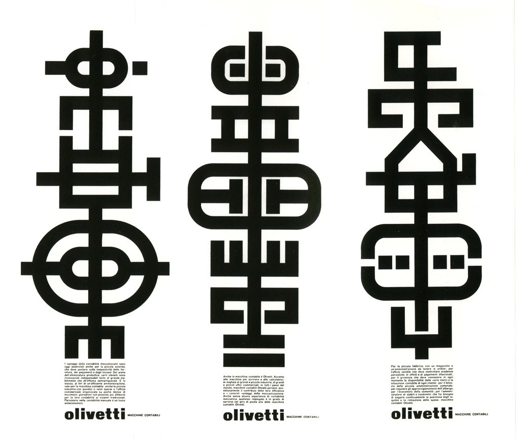
Giovanni Pintori, Machines for bookkeeping, 1962, courtesy of Letter form Archive
Communication strategy was that of coordinated image. In visual communication, 'coordinated image' denotes a semiotic coherence of representative elements of the company or brand, such as logo, colours, fonts, communication strategy, and so on. The aim is what we now refer to as brand awareness, brand recognition, but above all the ability to occupy a space in the collective mind and imagination.
This overall vision has made Olivetti a brand with its own personality, immediately recognisable. Yet we cannot talk about Olivetti's graphic advertising without mentioning Giovanni Pintori, designer since 1938 and later art director of the Technical Advertising Office from 1950 to 1968.
His works won the Palme d'Or and international acclaim, exhibited from New York to Paris, London to Berlin and Japan, and remain cult objects to this day.
Born in 1912 in Tresnuraghes, Sardinia, he immediately distinguished himself for his graphic skills. He won a scholarship from Nuoro Economic Council and entered the Istituto Superiore per le Industrie Artistiche in Monza. As a prodigy student, he was called to collaborate on the Aeronautics Exhibition in Milan, where he met Adriano Olivetti.
In 1936, following the footsteps of fellow countryman Costantino Nivola, he joined the Ivrea company. Pintori's technique shone with flair and personality, as well as quality, and he shortly afterwards established himself as an esteemed and well-liked professional, both inside and outside the company, gaining unexpected fame.

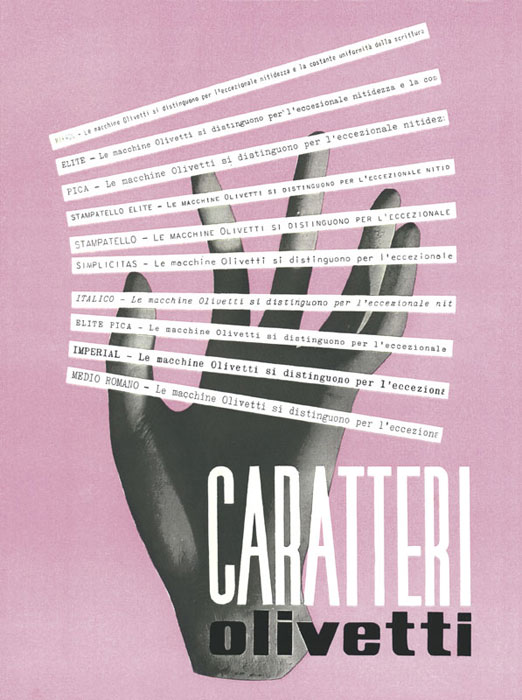


The poetics of metaphors and customs.
Giovanni Pintori, on his arrival to the Advertising Office, directed by the engineer and poet Leonardo Sinisgalli, is assigned the task of turning advertising into a manifesto, into art.
He had to expand and recolour the grey imagery of office products, give them a soul, place them in the everyday, more familiar, personal sphere. This was the mission. And so inkwells became flower holders, and flowers bloomed undisturbed on abacuses, because Olivetti machines solve everything!
Or, another stratagem: simplifying the world of the product on sale, of calculators. A poster of coloured numbers, evoking the machine but making it playful. Colours and geometries to signify the logical processes of the product, which are not random but appear simple, brilliant. A bouquet of flowers, the perfect gift, accompanies the silhouette of Lettera 22.
Or again, the solemnity of the chiaroscuro of a mechanical gear, of internal components that reveal the "mystery" of the device, how it works,
inspired by the sketches of the great Leonardo da Vinci.
If factories are the place of machines and products - which rarely appear directly in Pintori's posters - it is instead reassuring, everyday little things, that constitute the designer's stylistic signature.
The poetics of metaphors, this is his strategy.
The explicit illustrations of the products give way to geometries and primary colours, flowers, the body, animals... a sort of magic, the product is absent, but perceived. The 'trauma of modernity is over; the mechanical is restored to a human dimension.
It should be clarified that according to Olivetti's philosophy of unitary work, of collective design, it was not common practice to attribute authorship of projects to an individual. Despite the fact that many posters are conventionally associated with Pintori, it is likely that where there was Pintori there was also Nivola, who also worked on several of these projects.


Costantino “Titinu” Nivola, ecclectic and innovative artist.
Born in Orani, Sardinia, year 1911; same scholarship and the same Institute of Arts in Monza, companion and friend of Pintori, he arrived at Olivetti before him, becoming director of the graphics department, under Renato Zveteremich - Sinisgalli's predecessor.
Zveteremich would often " challenge" Nivola's skills with works that needed colour, a pictorial intervention to soften the harshness of the manuals.
It is difficult to speak of absolute authorship, as we have said, but the History of Writing brochure is a splendid example of Nivola's excellent graphic contribution.
Together with Sinisgalli, who wrote the text, the brochure depicts the machine as a magical instrument, “organised and sensitive”, “a mythological hand that has 45 fingers”.
Nivola's works present a more suggestive, surrealist allure, a search for estrangement more in harmony with Fontana's works. Nivola puts his multifaceted talent to the test, also taking care of window displays and exhibitions for - but not limited to - the company, shedding his guise as a publicist and graphic designer for that of painter and sculptor.
But this is only a smidgen of the extraordinary output of this artist, inside and outside Olivetti, who will always consider himself a disciple of enormous humility.
And so in Milan, in the Galleria, in front of the Olivetti showcases, curious people flock, like kids at the cinema, to see the ever-new results of artistic synergies, of collaborations between artists and thinkers.
For the Ivrea-based company, this period was one of the most fruitful, culturally speaking. Olivetti's showrooms were a meeting place for artists; it was the Renaissance of the mingling of the Arts.
Mass advertising had created soulless, detached buyers; Olivetti's synergies, on the other hand, aimed at a
“humanism of advertising“,
the creation of ideas and images that would live in people and grow with them, leaving something behind or sowing thoughts.
"I want Olivetti not only to be a factory, but a model, a way of life. I want it to produce freedom and beauty, because it will be them, freedom and beauty, who will tell us how to be happy", Adriano Olivetti's words, the manifesto of a pioneering model of company welfare, of a “factory designed for men
”,
and not the other way around, as he liked to say.
Libraries availability - and not only for employees, but for the whole community - reduced working hours, medical assistance, space and time to share ideas, amongst engineers, workers and passing artists, without power hierarchies and psychological arrogance. And if this was what the factory incorporated, shops too aimed at encouraging people to acquire ideas and dreams, even before the promotion of their products. Buying Olivetti meant in some way having the opportunity to share its ideals.
Through a majestic action involving artists, architects, designers - both Italian and foreign -, according to the credo of
“unity in diversity” Olivetti shops became places of culture and revolution.
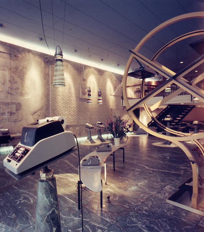
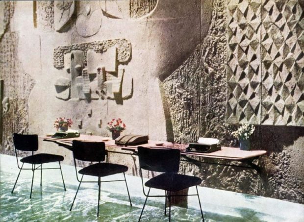
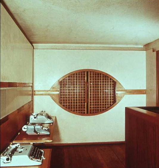
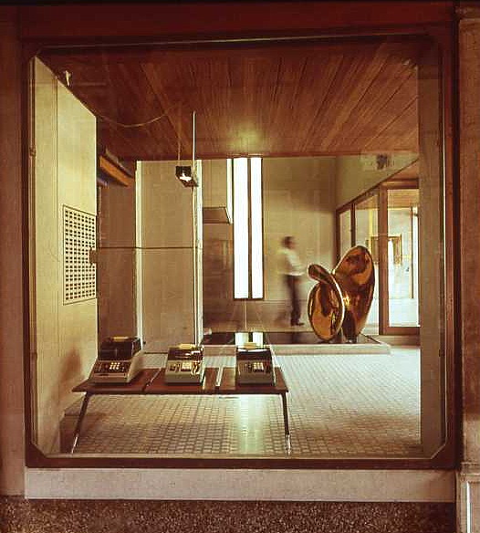

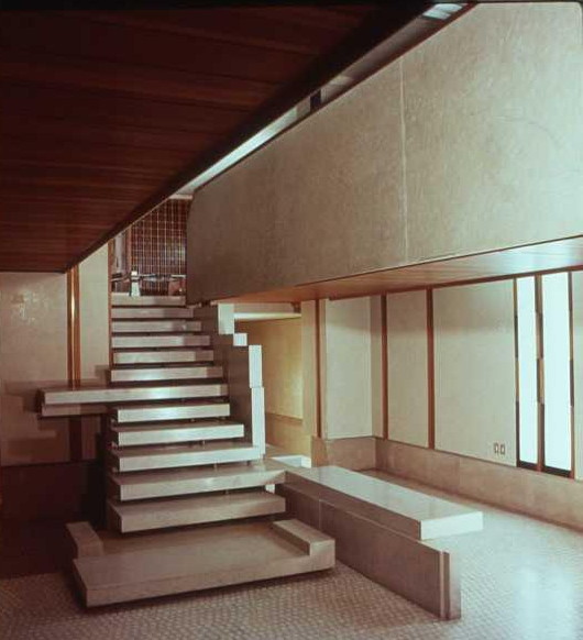
We see this also in the Sardinian shops.
In Sassari, in addition to the small branch and several dealers, a splendid showroom was set up in 1952, which was the result of a collaboration of various leading figures in the Sardinian territory. Ubaldo Badas, a rationalist and de facto architect, created a simple yet brilliant space that recalled Olivetti's symbolic product: the typewriter. A glass entrance, which would resemble the short side of the machine, led to a deep rectangular space with a coffered wave vault, reminiscent of its keys.
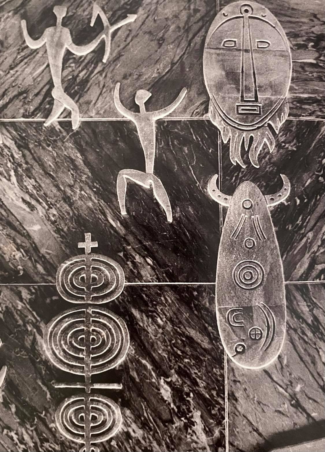
Completing the coordinated work of magic is the great Sassari artist Eugenio Tavolara, who creates an enormous low relief in marble and steatite across the long side of the shop, the "back" of the machine. In full Olivettian spirit of mixing the arts, Tavolara refers to the brochure designed by Costantino Nivola, History of Writing.
Nivola's illustrated work traces human progress in the art of writing, from papyruses to amanuensis, up to the progress of typewriters.
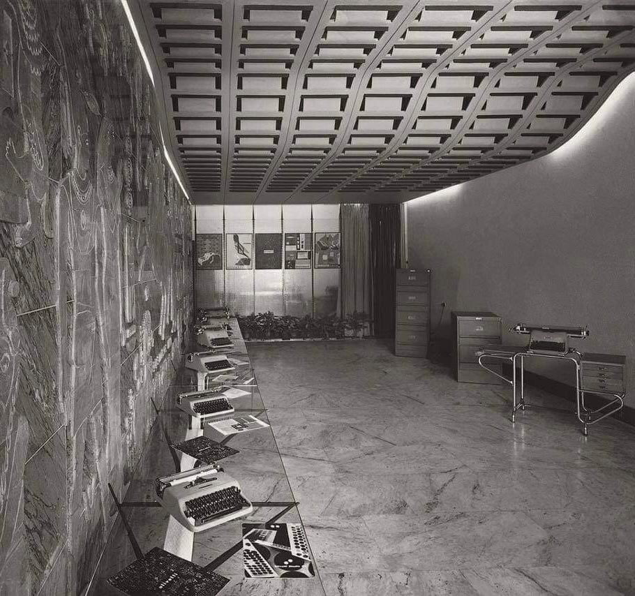

Tavolara reworks the summary of these stages on stone, adding his usual symbolism of alchemy and astronomy, celestial and astral figures, as well as references to Sardinian cultural and historical heritage.
Nuragic helmets, stylised archers and prehistoric animals appear alongside steles and clay tablets. Tavolara is deeply rooted in the need to enhance the island's identity, and he never missed the opportunity to work in concrete terms.
In this involucre of magic and craftsmanship, machines and calculators silently display themselves, well lit and visible even from outside the shop, thanks to the glass frame.
In 1965 the shop - which had been a crossroads for local people and companies - closed, and Olivetti left the low-relief as a gift to the council; it was dismantled into pieces and forgotten for almost twenty years, and then, restored, found a new home in the conference room of the Municipal Police.
Acknowledgements
The author would like to thank the Nivola Museum, the Olivetti Historical Archive and Ilisso publishing for their kindness and assistance.


